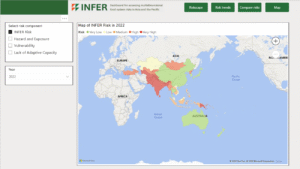
I made this Power BI dashboard to allow users to explore the results of the INFER Food System Risk Index. This dashboard was a prototype for the final version, which can be seen here. I was part of the team who developed the INFER index, bringing together data from diverse sources, covering climate hazards, economic indicators, and social factors.
The INFER index comprises 95 indicators, covering the period from 2000 to 2022 for 49 countries in Asia and the Pacific. The overall risk score can be broken down into three dimensions: Hazard and Exposure, Vulnerability, and Lack of Adaptive Capacity. Each of these dimensions is further broken down into categories and then components. Hazard and Exposure is made up of two categories: Natural and Human hazards. Vulnerability and Lack of Adaptive Capacity are each made up of the six dimensions of food security, namely Access, Agency, Availability, Stability, Sustainability, and Utilization. This structure allows users to look beyond the overall risk score and examine the drivers of risk.
Leave a Reply